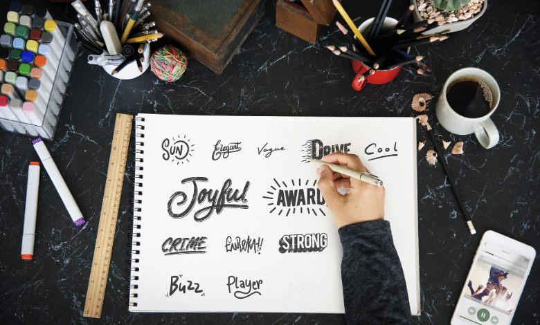
Fonts play a big role in design. They help people notice and understand messages. Some fonts are quiet and simple. Others are bold and expressive. Display fonts belong to the bold group. They are made to catch attention quickly. TypeType uses this font style when a design needs strong impact.
These fonts are not made for long reading. They are created to stand out. Large shapes and unique styles make them special. When used in the right place, display fonts make designs memorable. They help brands show personality clearly.
Why Display Fonts Matter in Design
Design is often about first impressions. People decide very fast what they like. Display fonts help create that first strong look. TypeType chooses them when a message must be seen instantly.
These fonts attract the eye. They guide attention to key words. This makes content easier to scan. A strong headline with display fonts can stop scrolling and start interest.
Display Fonts and Brand Personality
Every brand has a feeling. Some feel fun. Some feel bold. Some feel creative. These fonts help show this feeling through letters. TypeType matches font style with brand tone.
A playful brand may use rounded shapes. A bold brand may use sharp lines. The font should match the message clearly. When the font feels right, the brand feels stronger.
Where Display Fonts Are Commonly Used
This font style works best in short text areas. Designers use it when they want impact. Common places include:
- Headlines and titles
- Posters and banners
- Logo designs
- Advertisements
TypeType always checks the purpose before using display fonts.
Display Fonts for Logo Design
Logos need to be unique. They must stay in memory. These fonts help logos look different and strong. TypeType selects logo fonts that stay readable.
A logo font should not be too complex. It must look good in small sizes. Clear shapes help the logo stay clean. Strong letters help brands feel confident.
Display Fonts for Headlines and Titles
Headlines need attention. This is where display fonts work best. They make titles bold and clear. TypeType often uses them for page headings.
These fonts work best with few words. Long sentences can feel heavy. Short titles look better. Clean spacing keeps the design balanced.
Readability Is Still Important
Even bold fonts must be readable. Some styles look good but are hard to read. TypeType avoids fonts that confuse users.
Good spacing helps clarity. Letters should not touch each other. Clear text improves comfort. This makes designs feel professional.
Display Fonts in Print Design
Print design needs strong text. Posters and covers need bold letters. Display fonts work well in print projects. TypeType tests fonts before final printing.
Thick strokes print better. Thin lines may fade on paper. Balanced weight keeps text clear. This helps messages stay strong in print.
Display Fonts for Creative Projects
Creative work allows freedom. Designers can explore shapes and styles. Display fonts add emotion and personality. TypeType uses them in creative layouts.
These fonts work well with simple backgrounds. They bring focus to the message. Clean layouts let the font shine.
See also: Bring Easy Luxury and Comfort to Your Home with Evig Technology
Display Fonts in Modern Design
Modern design often mixes styles. Clean body text with bold titles works well. Display fonts add contrast to simple layouts. TypeType uses this balance often.
White space and bold text work together. This makes content easy to follow. Modern design feels fresh and clear when fonts are chosen wisely.
How to Use Display Fonts Correctly
Using bold fonts needs care. Too much can feel noisy. TypeType uses display fonts only where needed.
They are best for headings, not body text. Pairing them with simple fonts works well. Testing on different screens is important. Good use improves user experience.
Choosing the Right Display Font
Choosing a font takes time. Designers must think about audience and message. TypeType studies brand needs before selection.
Fonts should be tested in real designs. Size and spacing matter a lot. The right display fonts feel bold but clear. They support the message without effort.
Final Thoughts
Fonts shape how people feel about a design. Bold text creates strong impressions. Display fonts help designs stand out fast. TypeType helps brands choose the right font style for impact. Always use bold fonts with balance and clarity.